
Monday, October 1, 2012
Tuesday, September 18, 2012


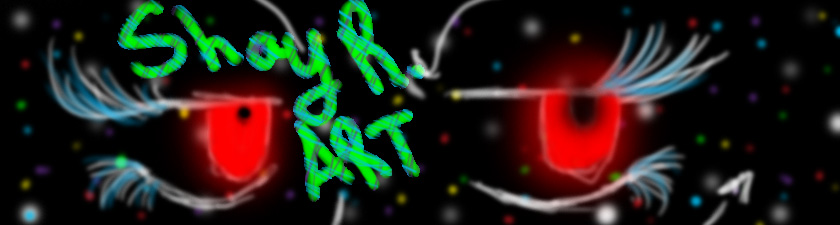
Tuesday, September 11, 2012

Monday, August 27, 2012
Logos I enjoy


Volcom logo: I love the sketchy edges of this logo I really like sketchy designs for some reason.
Skullcandy logo: This logo one means music to me and I love music. Also I find the skull very cutely creepy... does that make sense?
Firefox logo: I loooove the colors in this logo and the way they blend on the fox. Also the way they shade him.
Avengers logo: Very clean nice lines (awesome movie!) and I very like the slightly metally look to the texture.
Symbolism and Logo comparison
Logos and symbolism are a lot alike in the sense that they both use a picture to depict a meaning, but logos are more commonly used for businesses and marketing where symbolism is more commonly found in art. Logos use symbolism how ever to catch their customers eyes and to represent their product in a shape or design as well as show their company name all in one depiction. The idea of a logo is to let the customer associate the depiction with their product and name, where as symbolism does a similar thing. Like in symbolism they relate the vulture with death or dying, a black cat with evil bad luck, the dove with freedom and or love, and a shield with protection. Logos and symbolism go hand in hand with this though relating pictures with a certain object or meaning. Like when we see the Fox logo we associate it with sport wear and such.
Thursday, May 17, 2012

Friday, May 11, 2012

Monday, April 23, 2012
Friday, April 13, 2012

Thursday, March 29, 2012
Reflection

Friday, March 23, 2012
reflection

Monday, March 19, 2012
Thursday, March 15, 2012

Tuesday, March 13, 2012
Goal
Get outline and start on color. Also talk to my friend that's writing the comic with me and get the rest of the characters designs.
Monday, February 27, 2012
Thursday, February 23, 2012
weekly reflection thingy
Ive decided to start an illistration instead of my animation because it wont be done in time. I havent started the illastration yet but i will next time.
Thursday, February 2, 2012

Tuesday, January 31, 2012
Art analisis

insperational images


all the rest by Macy (forgot her last name but she's SpiralStaircasesEatU on deviantart.com)
goals
my goals for this week are to get all caught up on my missing work and restart my animation (messed up) and maybe get some color in a few of the first few slides
Wednesday, January 4, 2012
Rough Project Idea
For my project I was thinking on making an 2D animation of "what rings in my head." It will make more since later on :)
Subscribe to:
Posts (Atom)